Official CI
CI of Kiheung is based on the vision 'aiming for the best enterprise in businesses related to transportation of human' and therefore is shaped in a simple yet strong and sharp symbol using K of Kiheung in order to express the dynamic values of the company that creates positive and creative culture, earns trust as the leader of the business, and creates fun events at all times.
Adopting blue color symbolizing trust as the main color and initial K in the strong and dynamic shape, it will become a symbol of Kiheung's every visual communication.

Signature
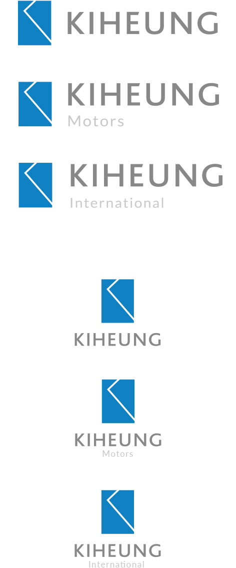
This is a signature logo applied from the official CI of Kiheung Group. It is a combination of symbol mark and logo type in horizontal and vertical forms, and is used depending on the media situation.


Symbol
Symbol of Kiheung adopts blue color symbolizing trust as the main color and initial K in the strong and dynamic shape to symbolize Kiheung's every visual communication.


Logo
English logo of Kiheung adopts Bliss Regular which is a special font used for Kiheung CI. English logo is a symbol representing the core element of its every visual communication and therefore requires special attention to the application of shapes and colors.
English logo also constructs the basis of Kiheung CI so it cannot be used solely or substituted with other fonts.

Regulations
on exclusive
colors
Regulations on exclusive colors
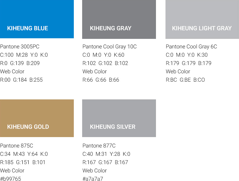
Exclusive color applying to Kiheung CI is another means to differentiate Kiheung with so it is important to use the designated colors continuously in a uniform fashion.
Application of pantone colors as an exclusive color is a basic rule and four-color printing can be performed according to medium (newspaper, magazine, etc.). In case of four-color process, there can be a great difference in brightness and chroma so the best standard colors need to be obtained by comparing color samples and pantone color number is advised to be used when selecting a color for medium's copy.
